As humans we want to feel things. In movies or stories they want the audience to be moved to have an emotional response. Design is no different.
The founder of Design Wiz Tech, Manish Sinha, writes in his article The 7 Principles of Design Psychology: How to Create Design that Resonate with your Audience, published on LinkedIn, “As a designer, your primary goal is to create designs that not only look good but also connect with your audience on a deeper level. This is where design psychology comes into play. Design psychology is the study of how design influences human behavior and emotions. By understanding the principles of design psychology, you can create designs that resonate with your audience, evoke the desired emotions, and drive action.”
The website for Natural Resources Conservation Service (NRCS) is riddled with UI/UX issues. The Connecticut page is supposed to be a resource for finding programs that can help farmers regarding soil and water conservation and to help protect and conserve natural resources on private lands.
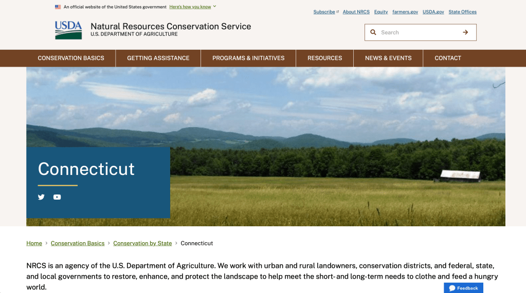
At first a farmer would feel excited at the prospect of getting financial assistance to improve conservation efforts on their land, extending the farm’s purpose.
With any government website it’s easy to feel overwhelmed because of all the information being presented at one time. All a farmer wants is to gain knowledge about programs and UX doesn’t allow for an easy way to get there.
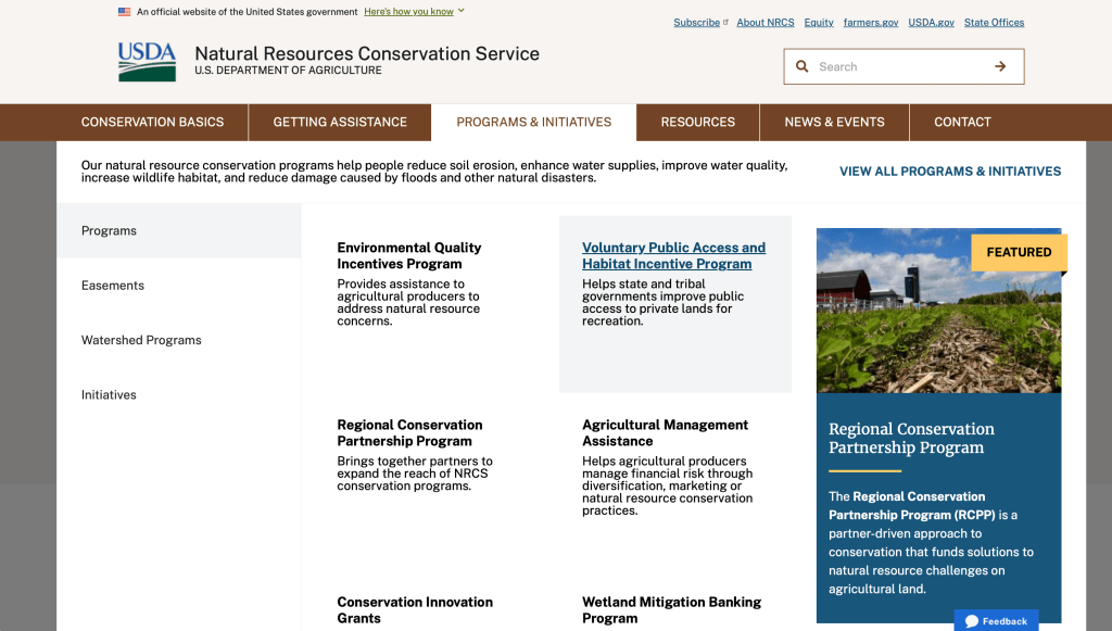
Across the top of the page are what one would think lead to the desired state’s programs and services. This is where the user becomes annoyed at the fact clicking on the link takes them back to a national page with generic information. The need for easy-to-use doesn’t exist.
It is Disappointing to have to go back and forth from the state site to the national site to find information you’re looking for. As you keep looking and clicking at the top of the page anxiety creeps in because the site is awful to navigate.
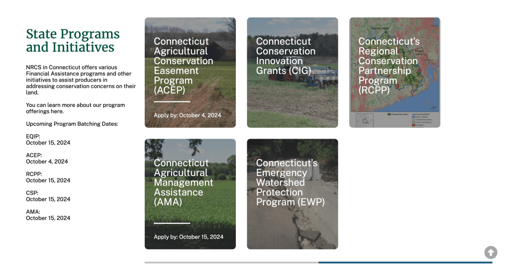
The only thing to be optimistic about is that the state programs information can be found. What the user would need to figure out is that scrolling down several times program information can be found. Thankfully, those link keep you within the state site. I am so happy I’m not the user struggling to navigate this site for the first time.

iRunner is a free fitness tracking app used for a workout or cardio training. It tracks both daily steps and activities recording the speed and pace of your workout, indoor or outdoor. Use it as a pedometer for your health and fitness with daily activity tracking.

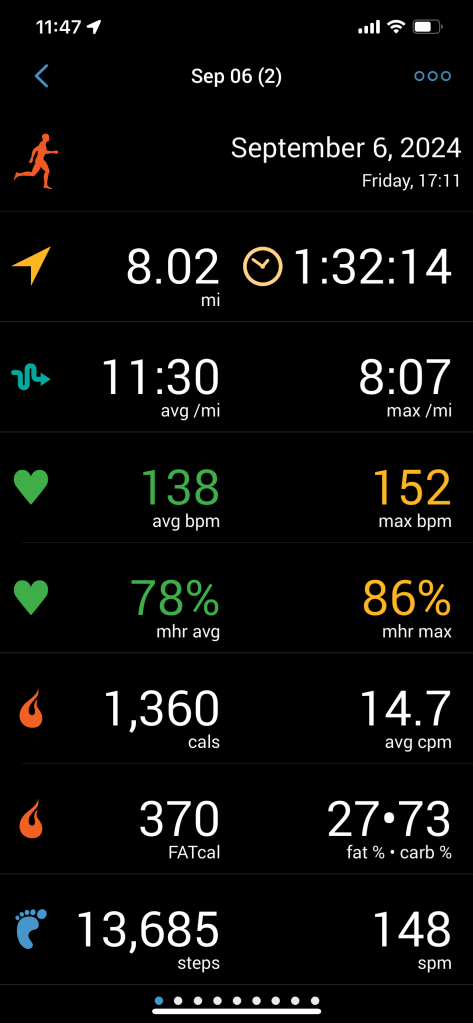
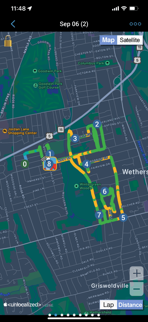
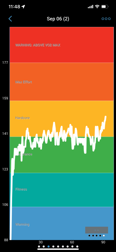
I am a user of iRunner and I track all my runs and walks. I’m proud when I look back at my runs and I can see what I accomplished, no matter if it’s distance or a new time record.
From a UI/UX standpoint I’m thankful the app functions like I would want a fitness app to, with simple icons for the various workouts (my predominate use is running) and along the bottom I can access for more specific information regarding different health aspects, which I appreciate for my own well-being.
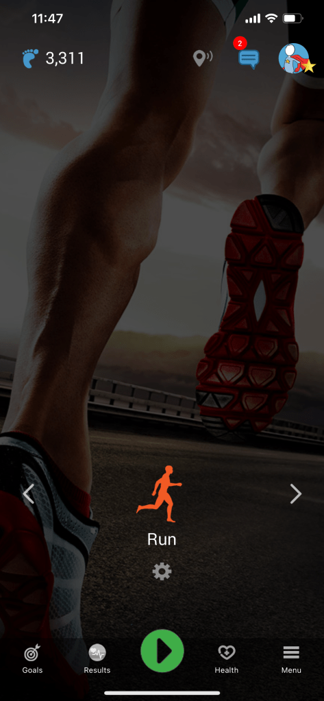
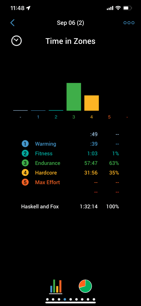
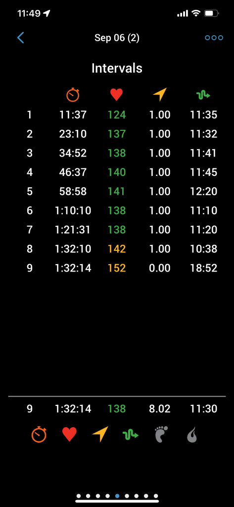
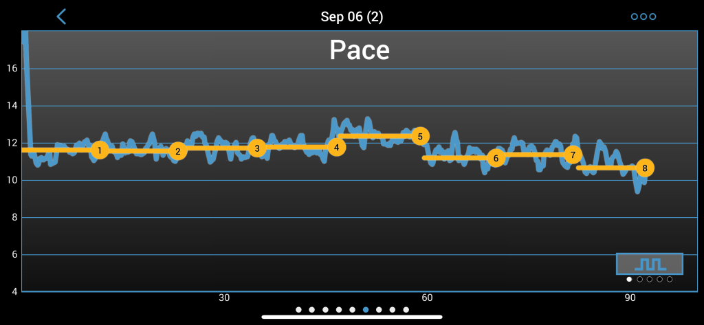
I need for tracking my movement and exercise is the driving force behind using this app. An added bonus is connection between devices. I can use my iPhone or my Apple Watch to start or stop the app and I can view my results. I’m excited to run every time because I want to see my improvement.
For additional engagement I see my goals and track personal records (PRs) as I continue my training. That keeps my motivation strong to keep using this app.
A well designed website or app will encourage engagement and interaction. On the other hand a poorly designed site will be long forgotten and lost in the vast expanse of modern technology, because there is no value to be found.

Leave a comment