Success is journey where the only true measurement can bet are upon reflection. In my humble opinion, growth in self, talent, and ability are professional achievements. I would only do myself a disservice if I didn’t look back to see how my design skills have evolved these last few weeks.
From day one I made clear, I’m no designer. This class was going to challenge me from the start and force me to step outside of my comfort zone. Just like exercising, stepping out of what is comfortable allows for growth.
Stephan Miller writes in his article Basics of Graphic Design: Principles and Elements published on Capterra.com, “The impact of graphic design on modern businesses cannot be overstated. It plays an important role in capturing attention, conveying messages, and building strong brands.”
This was part of the anxiety I felt. If you see a great design it goes unnoticed, but you see a bad design it sticks with you. I didn’t want to produce bad designs and be known as “that designer” in the class. All joking aside, design is all around us and branding is everything.
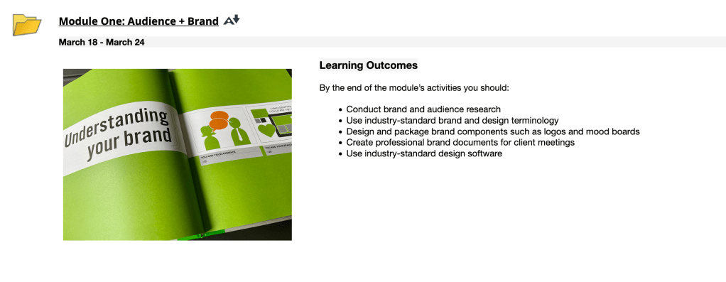
Assignment one: Audience and Branding. No pressure. Just turn in logos, a mood board, and brand plan. Ok, maybe a little pressure.
First, I need to find out what a mood board and brand plan are.
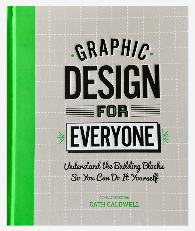
Cath Caldwell writes in the book Graphic Design for Everyone, “THere’s a lot to keep track of when creating a brand, and organization is key. Setting yourself deadlines for the different stages and knowing what comes next will help you focus on current tasks and keep your eyes on the goal – using your brand to launch a successful project.”
This first week made me start thinking differently. That shift in thinking kept changing week to week. I needed to keep pushing and growing. To kept trying to improve.
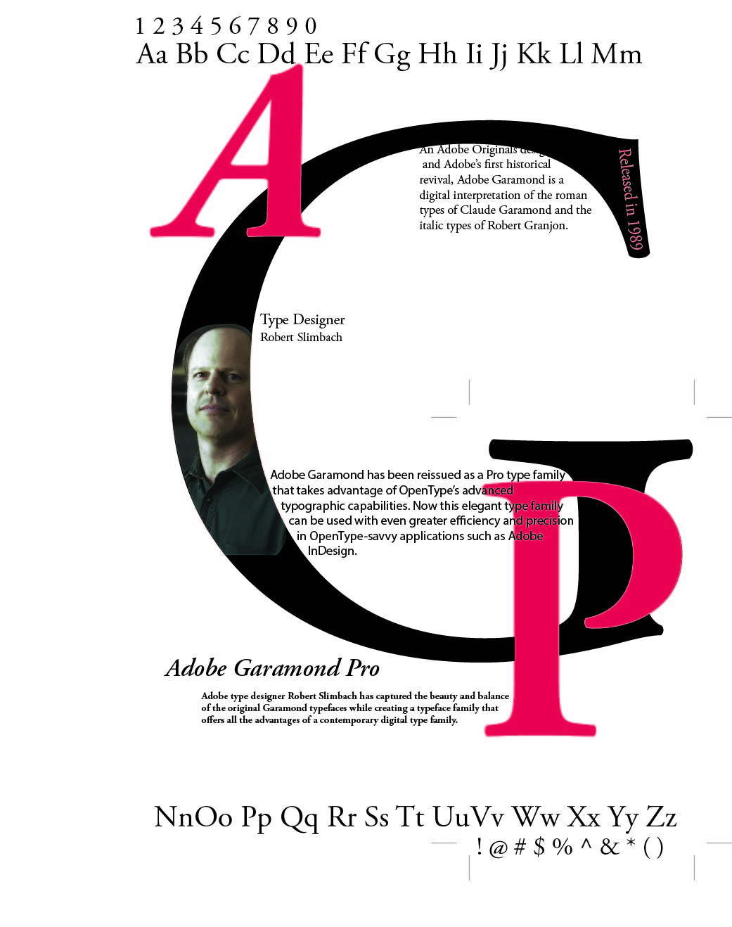
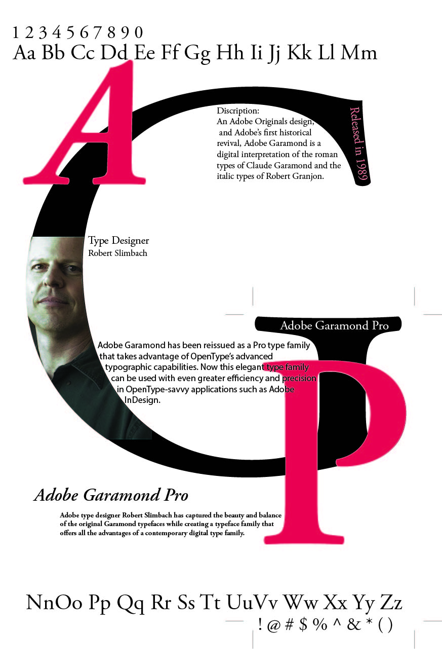
A great example is the following week two assignment on typography. I really liked this assignment. The feedback that I really took to heart was to go extra to get a better result. I used a photograph of the designer of the typeface Adobe Garamond Pro and his head was cut off near the top. I went back and found a picture of his full head and that indeed make for a much better final product.
“The terms “principle” and “element” are often used interchangeably when referring to graphic design terms but there is a difference. The principles are the rules that govern how the elements of graphic design are used. The five basic principles of graphic design are balance, hierarchy, repetition, alignment, and contrast,” writes Miller.
To me this sums up design. Those five principles guides us into products that are appealing and deliver the message our clients require. That may be simplifying things but great designers have mastered those five principles.
As a design novice, I don’t have a mastery. With any art form it takes work and practice. This design thing reminds me of golf, where you get addicted when you get that perfect hit. When you produce that one product that makes you proud, you’re hooked. I had a couple moments of pride and now my brain is full with new ideas and design I want to try.

Leave a comment