I’m a tall fella at 6’5” and well over 200 lbs. I’m usually the one to intimidate, but this, this grid and composition scared me. Afraid of the unknown, I’ve never done this before and I’m completely out of my comfort zone.
Cath Caldwell writes in Graphic Design for Everyone, “In design, a grid is a structure that sits invisibly underneath your layout and helps you arrange elements in an organized way. When you design, use grids to help you maximize the meaning – and visual appeal – oof layouts.”
My creative mind wants to go big. Coming up with great visions in my head of what my newsletter will look like and a website. Visually appealing and organized with columns of text and photos all joining in what would be considered the Holy Grail of student projects.
I took and pencil to paper and I sketched, nothing. My mind was blank. I forgot how every website I’ve seen looked. How every newsletter I’ve subscribed to flowed. My mind was empty.
Ok, time to regroup. Maybe set my sights a little lower on the grandiose scale. I’ve never done a wireframe so I may need some help.
Jerry Cao writes in his article Website Mockups: 4 popular approaches to explore, on the website Creative Blog, “Website mockups can be created in lots of different ways. It’s true there is no ‘best’ approach, but depending on certain UI and UX designers’ styles and preferences (and the design process), some will work better than others.”
My anxiety decreased as I learned there are tools that can help me form a vision and get me to the finish line.
“Don’t make the mistake of thinking all website mockups are the same. Simple decisions about platforms, fidelity, and coding will all produce significantly different results. Know what you want and what your goals are before you even begin the design process – if you want a tool that supports all three phases, it’s best to start out using it than to switch over halfway through. Likewise, if you need a stellar, fully realistic mockup, keep in mind that you’ll be using a graphic design editor at some point,” writes Cao.
What? Coding?
I quickly checked my assignment details. No coding. Deep breath. Exhale. Simple. I reminded myself I’m not a designer and therefore my work will not reflect that of an expert but of that as someone growing and learned. Keep it simple and learn.
Cao writes, “dedicated mockup tools have clear advantages: Beginners benefit from their ease of use, while experts appreciate the designs specifically tailored to their advanced needs. On the more advanced end, tools like Framer and Principle specialize in animations and interactions for mockups.”
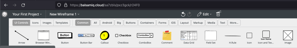
I used balsamic to help me and maybe try and get me out of my head and over thinking. I’m aiming for simple.
I created a website and newsletter wireframe. Expired the PDF and then opened up Adobe Illustrator. I have a comfort level now with Illustrator and to bring pictures and all over felt more natural.
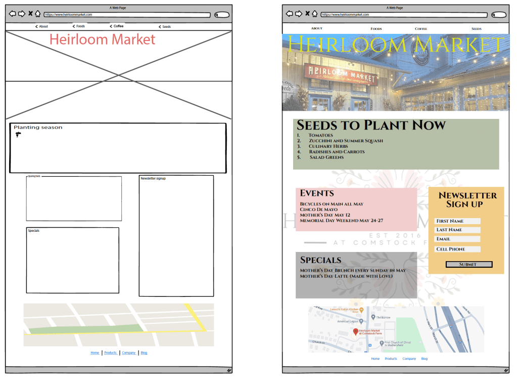
Submitting my work I take another look over. I feel as good as it’s going to get. Will my intention of boxes being clickable come through? Did I follow the right principles?

I still feel insecure designing things. I question if my thoughts are conveyed through my design. I may miss the mark because I am still learning. That’s ok. I will learn from my shortcomings.

Leave a comment