I once thought that fonts were universally agreed upon as the way the letters look as they form words. How foolish I was to think in such a simple way. Typeface, that’s what we mean. That’s the marketing we see where know a brand by its font… gasp… I mean typeface.
Let me start over. A typeface is a set of distinct glyphs that characterize a particular style of lettering. Fonts are variations within a typeface, like italic or bold. So the latter is part of the former. whew I got through that.
This journey of discovering the difference brings a feeling of superiority. I now know the difference and I can and will rub my superior knowledge in people’s faces. Actually I won’t, because this crazy English language is hard to unlearn when I’ve spent decades using the wrong word. It’s like my dad realizing there is no R in Washington, yet her continues to say Warshington. My spell check hates how that last sentence ends.
Too many times while writing this week I had to go back and delete font and replace it with typeface. That’s ok because that’s learning. I’m growing as a reader, writer, and an artist. I’ve thought little about typefaces as a photographer and videographer other than finding a script font.. I mean typeface… to use for a cool signature effect. Those days are over. I know typefaces evoke meaning and feelings. Not just in print, but in video as well.
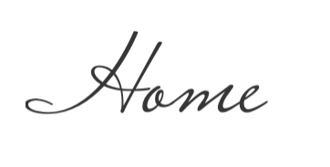
Simple nouns in different typefaces can elicit much different responses. Take home for example. Written as:

I have a calm and easy feeling about home. Now, written as:

I have a very and starkly different feeling of home. I’d be afraid of that home
I have a very and starkly different feeling of home. I’d be afraid of that home.
I realize I have a typeface bias. I am sucker for all things script. When I was working on my nouns most of the typefaces were of a script form. As I put thought into why I love script so much it is that a script looks as though a human hand is writing the words. Where there’s human there’s emotion and heart. I can feel script.
Yes, I know its all digital and is the creation of a designer made to look like a signature. I know this. I remember a day and age when hand written notes were passed instead of a text, direct, or instant message with an emoji or bitmoji. Most reading is done in some digital form of serif or sans serif. Those communicate just fine and will continue to do so.
As I sharpen my designer tools I ask myself, is there a way to find the same human emotion I find in a graceful script typeface as in a sans serif? I say yes. When all is done the typeface is only one part of what tells the story. The words, with all their meanings, carry the weight of the emotions.

Just because the typeface makes it look pretty doesn’t mean it is pretty.
Leave a comment